Rigid panels have been used as painting supports for millennia, and are an excellent alternative to canvas. There are oil paintings done on panel that are still in excellent condition after 500 years. The greatest flaw of canvas is that it is not rigid, and the condition of many older paintings have suffered because of this fact.
Panels can be made to have a wonderfully smooth surface that is excellent for painting in detail. For those that desire a more textured surface, canvas can be glued to the panel, for the benefits of both.
A lot of materials are suitable for use as painting supports. I have organized some of the more popular choices into groups.
WOOD
Wood is one of the oldest painting supports, having proven itself in use over thousands of years. Many different species are suitable. Historically, Poplar was a common choice in Southern Europe, Oak in the north.
Wood has some drawbacks. It can rot, and be attacked by pests. Wood is not always dimensionally stable, and can warp. The susceptibility to all of these problems will vary by species.
With the right preparation, these issues can be minimized. Wood should be aged properly to ensure that it is dry and acclimated to its environment. This process used to take up to ten years. Nowadays, most woods are kiln dried, which does not always ensure a wood is completely dry. I try to work around this issue by using old or reclaimed wood.
Panels made from wood were usually braced in some manner to make them stronger and to resist warping. There were a variety of ways of doing so. Ongoing research by conservators suggests that these methods may do more harm than good. Braces can't stop a panel from eventually warping, and in the process put extra stress on the wood.
I have chosen not to brace my panels. The method I have adopted instead is to size and gesso the panel equally on both sides to ensure it is sealed. This is based on historical recommendations and backed by modern research. I use wood that is as close to quarter sawn as possible. This is wood that is cut down the center, so that the grain runs parallel along its length, making it more likely to be warp resistant.
Plywood is made by gluing many thin sheets of wood together, in alternating layers. This makes a solid sheet that should be stronger and more warp-resistant than the same wood in regular form.
Plywood suffers from drawbacks unique to its construction. Boards can warp, plies can de-laminate, and the glues used to hold plies together can leach out and cause damage to the paint. The quality and price of modern plywoods is all over the map. I've had a lot of issues trying to use plywood as a painting surface with traditional gesso. Soon after making them, my panels developed micro-fine cracks, caused by the wood grain swelling from moisture. This is fairly common, from what I understand. I would suggest doing your own tests and experimenting, before using plywood on anything you consider important.
ENGINEERED WOOD PRODUCTS
Products that have been manufactured using ingredients derived from wood. Their benefit is that they are more dimensionally stable than wood, should resist warping, are widely available, and inexpensive.
Hardboard, aka Masonite, is a type of dense fiberboard. It is made from wood fibers that have been compressed under extreme pressure, until they are bound together. No glue is used in this process. Hardboard is strong, dense, and has no grain.
Hardboard panels have been in use long enough to get an idea of their longevity, with mixed results. Some vintage paintings are in good shape, while others have not fared well. "Tempered" hardboard, has been coated with oil to make it more weather resistant. There are cases where this has reportedly leached into the paint surface and ruined it, so tempered products should probably be avoided.
The majority of premade "archival" artists panels are made from some kind of hardboard. Without knowing specifics about how a panel is made, I would think twice about using them for anything but smaller, more informal works.
MDF or Medium Density Fiberboard is made from ground wood fibers bound together by a glue or resin. It is weaker and less dense than hardboard. The resin used to bind the wood fibers poses a health risk as it is usually formaldehyde-based. Protection should be worn when working with MDF.
MDF is a relatively new material, so long-term permanence is still open to debate. How long the resins that hold the material together will last is a big concern. MDF is relatively soft, so it can be dented easily, especially around the edges. It can also swell if exposed to water. I would recommend sealing MDF on all sides before use.
METAL
Metal has been used as a panel support on a limited basis for centuries. Rembrandt used copper for some of his smaller works, and these are still in excellent condition. Provided that there is a sufficient bond between the paint and metal, it is in many ways the ideal surface. Metal is rigid, stable, and expands and contracts relatively little. The drawbacks include the added weight and expense of many metals such as copper, and the possibility for corrosion unless sealed from the atmosphere.
Thursday, November 11, 2010

Friday, October 29, 2010
Tonalism
This post is devoted to a style of painting known as Tonalism, that has had a large influence on my approach to making landscapes. The name refers to the use of a simple unifying color, or tone throughout a painting to create a sense of mood. Common subjects include twilight, sunsets, moonrises, nocturnes, and misty atmospheres.
The tonalist style was uniquely American, beginning in the mid to late 19th century as an outgrowth of the French Barbizon school of traditional landscape painting. The period signifies the emergence of the United States on the world stage, a country that was still very young at the time and had not matured artistically. The style was short lived, lasting only a few decades, and was notably eclipsed in popularity by Impressionism.
What has always appealed to me about tonalism are its soft and meditative qualities. Pictures made in the style have a subtle sense of mystery that draws in the viewer.
Probably one of the most famous painters associated with the style was George Inness. His early work was fairly tight, but as time went on, he began to develop a looser more atmospheric style, focused on conveying mood.

 George Inness, Sunset on the Passaic
He is one of the most expressive painters of sky that I have seen, particularly his ability to render the powerful fury of an approaching storm.
 George Inness, Étretat
The general softness of tonalism makes it well suited to oil painting. Only one artist in my experience, Edward Steichen, was able to capture the same qualities in other media. His career began as a oil painter, but he quickly moved on to photography. Steichen sought to merge the experience of both media together. By experimenting with technique and highly modifying his photos, he was able to create great tonal photographs.

Another big name was James Abbot McNeill Whistler. Whistler was influenced in his mature years, by the minimalist art of Japanese prints. He created many innovative works, his most famous being a serious of Nocturnes.
 James Abbot McNeill Whistler, Nocturne: Blue and Gold
There are many other fine examples of this style of art, even some are contemporary. I plan is to incorporate elements of the style in my own work as well.
The tonalist style was uniquely American, beginning in the mid to late 19th century as an outgrowth of the French Barbizon school of traditional landscape painting. The period signifies the emergence of the United States on the world stage, a country that was still very young at the time and had not matured artistically. The style was short lived, lasting only a few decades, and was notably eclipsed in popularity by Impressionism.
What has always appealed to me about tonalism are its soft and meditative qualities. Pictures made in the style have a subtle sense of mystery that draws in the viewer.
Probably one of the most famous painters associated with the style was George Inness. His early work was fairly tight, but as time went on, he began to develop a looser more atmospheric style, focused on conveying mood.

George Inness, Summer Landscape
 George Inness, Sunset on the Passaic
 George Inness, Étretat
Edward Steichen, The Pond—Moonlight
 James Abbot McNeill Whistler, Nocturne: Blue and Gold
Wednesday, October 20, 2010
Ultramarine, Part II
Natural Lapis lazuli is a beautiful stone , but in raw form a mediocre pigment. As I covered in the first installment lapis lazuli is not homogeneous. The brilliant blue color comes from lazurite, the other constituent elements being impurities. Only the very highest quality stones create a rich blue when crushed into a pigment. For centuries artists and craftsman had to make the best of the dull, ashy blue that was often a result.

Then sometime around the 13th century, alchemists developed methods to extract lazurite from its impurities. This involved adding the pigment into a melted pastiche of wax, resins, and linseed oil. The resulting blob of material was kneaded in a solution of water or weak lye. The pure pigment was released and could be collected. The work was time consuming and came at a huge expense.
Many recipes along these lines still exist. Among these, the most detailed was written by the artist Cennino Cennini in the early 15th Century. His book, Il libro dell'arte, or The Craftsman's Handbook is a charming guide to how art was made during the Renaissance. A whole chapter is devoted to pigments, including a very detailed recipe for lapis.
Cennini's describes a "plastic" to be made from beeswax, mastic, and pine resin. He calls for one pound of lapis powder to be used in the recipe. I had a lot less, so I adjusted each quantity accordingly.

Once I weighed out each ingredient, they were melted together in a saucepan.

I poured the plastic into a bowl, then added my lapis powder. I proceeded to knead the still liquid plastic until the lapis was evenly dispersed. Like kneading bread dough, one must cover ones hands with something so it does not stick. In this case Cennini says to use linseed oil, instead of flour. The plastic cooled quickly and began to form a soft, solid ball.

I let the plastic sit for 3 days, per Cennini's instructions. Each day I took it out and kneaded it again.
After this time had passed the plastic was placed in a bowl pull of warm dilute lye and kneaded again like bread. Because lye is caustic, I took precautions to protect myself. Cennini recommends using two round sticks while handling it in the lye. I used two chopsticks.
While kneading the plastic, the pure lazurite should gradually be released. Once it has settled on the bottom, the plastic can be removed, and the lye poured off from the fresh pigment. The first extraction is the purest and finest. Cennini recommends using fresh lye to repeat the process again in a new bowl. This will continue until all of the blue has been extracted from the plastic, and it becomes worthless.

I consider my attempt a partial success. While I was able to obtain some very fine pigment, the plastic began disintegrating in the lye almost immediately. I was not able to repeat the process many times, as Cennini recommends. A lot of small pieces of wax and resin ended up in the pigment, and will have to be removed somehow before it can be put to use.

I will need to do more research before I try this method again with my finest lapis.

A comparison of different grades of Lapis Lazuli.
Then sometime around the 13th century, alchemists developed methods to extract lazurite from its impurities. This involved adding the pigment into a melted pastiche of wax, resins, and linseed oil. The resulting blob of material was kneaded in a solution of water or weak lye. The pure pigment was released and could be collected. The work was time consuming and came at a huge expense.
Many recipes along these lines still exist. Among these, the most detailed was written by the artist Cennino Cennini in the early 15th Century. His book, Il libro dell'arte, or The Craftsman's Handbook is a charming guide to how art was made during the Renaissance. A whole chapter is devoted to pigments, including a very detailed recipe for lapis.
Cennini's describes a "plastic" to be made from beeswax, mastic, and pine resin. He calls for one pound of lapis powder to be used in the recipe. I had a lot less, so I adjusted each quantity accordingly.

Once I weighed out each ingredient, they were melted together in a saucepan.

I poured the plastic into a bowl, then added my lapis powder. I proceeded to knead the still liquid plastic until the lapis was evenly dispersed. Like kneading bread dough, one must cover ones hands with something so it does not stick. In this case Cennini says to use linseed oil, instead of flour. The plastic cooled quickly and began to form a soft, solid ball.

I let the plastic sit for 3 days, per Cennini's instructions. Each day I took it out and kneaded it again.
After this time had passed the plastic was placed in a bowl pull of warm dilute lye and kneaded again like bread. Because lye is caustic, I took precautions to protect myself. Cennini recommends using two round sticks while handling it in the lye. I used two chopsticks.
While kneading the plastic, the pure lazurite should gradually be released. Once it has settled on the bottom, the plastic can be removed, and the lye poured off from the fresh pigment. The first extraction is the purest and finest. Cennini recommends using fresh lye to repeat the process again in a new bowl. This will continue until all of the blue has been extracted from the plastic, and it becomes worthless.

I consider my attempt a partial success. While I was able to obtain some very fine pigment, the plastic began disintegrating in the lye almost immediately. I was not able to repeat the process many times, as Cennini recommends. A lot of small pieces of wax and resin ended up in the pigment, and will have to be removed somehow before it can be put to use.

I will need to do more research before I try this method again with my finest lapis.
Thursday, September 30, 2010
Charcoal
Last weekend, I started making some new charcoal. The first batch that I had produced earlier in the year made for an excellent drawing charcoal, but failed as a paint pigment. I'm working on refining the process, so that it can be used for both.
The trick is to bake the wood just right minus oxygen, so that it is mainly reduced to pure carbon. The wood should be allowed to breathe just a little, because it will outgas as it bakes. Allow too much air and it will be reduced to ash.

I gathered up willow branches, allowing them to dry several weeks in advance. They were stripped of all of their bark. Using the trimmers, I cut them into many small pieces.
I'm considering building some kind of retort to burn the wood in the future, but for the time being, I'm relying on the same methods I used for my first experiments.

The willow sticks were stuffed into a stoneware bowl lined with foil, wrapped again with foil, and the top of the bowl was covered. It was placed in the hot wood oven.

The charcoal fresh out of the oven. I would guess it is about 80 percent charcoal at this point.
The trick is to bake the wood just right minus oxygen, so that it is mainly reduced to pure carbon. The wood should be allowed to breathe just a little, because it will outgas as it bakes. Allow too much air and it will be reduced to ash.

I gathered up willow branches, allowing them to dry several weeks in advance. They were stripped of all of their bark. Using the trimmers, I cut them into many small pieces.
I'm considering building some kind of retort to burn the wood in the future, but for the time being, I'm relying on the same methods I used for my first experiments.

The willow sticks were stuffed into a stoneware bowl lined with foil, wrapped again with foil, and the top of the bowl was covered. It was placed in the hot wood oven.
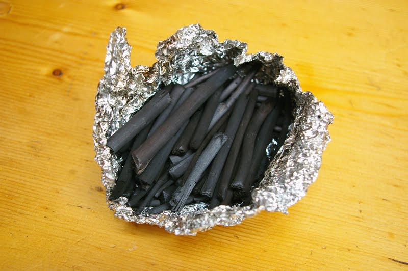
The charcoal fresh out of the oven. I would guess it is about 80 percent charcoal at this point.
Monday, September 20, 2010
A New Mortar & Pestle

Just a small update-I've purchased a new mortar and pestle, this time made from granite. Dark granite is stronger than most materials, and not much more expensive. I think it will be better suited to grinding hard minerals than the marble or porcelain I was using previously.
Thursday, September 9, 2010
More about Yellow
A bright yellow is an important addition to any artists palette. Modern yellow pigments are synthetic, based on mineral or organic mixtures. These colors, such as Cadmium yellow are permanent, and incredibly bright. For a painter wishing to achieve natural effects they demand caution and restraint, otherwise they can become overpowering.
On the other hand, there are less intense and more subtle historical alternatives that are still available today. These are all mineral-based. Natural organic colors such as Weld, are not lightfast, so I would not consider them.
Orpiment

Orpiment is a bright rich yellow, based on the natural mineral arsenic sulfide. The presence of arsenic makes it very toxic. In fact the mineral was once used as a fly poison.
Orpiment was a common feature on palettes going back to ancient times. It was a popular color in Italy during the Renaissance, but was not the preferred choice in Northern Europe. By the 19th century, Orpiment had been wholly replaced by alternatives.
Orpiment's other major flaw is that it is incompatible with lead and copper based pigments. This means it cannot be used in mixtures containing lead white, for instance. I feel that this is far too limiting, so I will not be using this color.
Lead-Tin Yellow

Lead-tin yellow is a synthetic bright opaque yellow, made by combining lead and tin oxide. Most varieties tend to be on the pale side. The color was most popular during the 15th to 17th centuries. Because it contains lead, it is highly toxic. It is also relatively expensive.
 An example of lead-tin yellow, from the painting Equestrian Portrait of the Duke de Olivares, by Diego Velázquez.
Naples Yellow

Naples Yellow is also made in the lab, by combining lead and antimony. The color varies depending on how it is made, but tends towards a deeper, more orange opaque yellow. It was gradually adopted as a replacement for Lead-tin yellow, probably around the 16th Century. It is highly toxic.
As lead has been gradually phased out of most products, genuine Naples Yellow has become hard to find. Most colors sold today going by the name are imitations. They are convenience mixtures that lack the beauty or permanence of the real thing. When purchasing the color one must ensure that it is genuine. Real Naples Yellow is expensive, so a low price should raise suspicions.
On the other hand, there are less intense and more subtle historical alternatives that are still available today. These are all mineral-based. Natural organic colors such as Weld, are not lightfast, so I would not consider them.
Orpiment

Orpiment is a bright rich yellow, based on the natural mineral arsenic sulfide. The presence of arsenic makes it very toxic. In fact the mineral was once used as a fly poison.
Orpiment was a common feature on palettes going back to ancient times. It was a popular color in Italy during the Renaissance, but was not the preferred choice in Northern Europe. By the 19th century, Orpiment had been wholly replaced by alternatives.
Orpiment's other major flaw is that it is incompatible with lead and copper based pigments. This means it cannot be used in mixtures containing lead white, for instance. I feel that this is far too limiting, so I will not be using this color.
Lead-Tin Yellow

Lead-tin yellow is a synthetic bright opaque yellow, made by combining lead and tin oxide. Most varieties tend to be on the pale side. The color was most popular during the 15th to 17th centuries. Because it contains lead, it is highly toxic. It is also relatively expensive.
 An example of lead-tin yellow, from the painting Equestrian Portrait of the Duke de Olivares, by Diego Velázquez.
Naples Yellow

Naples Yellow is also made in the lab, by combining lead and antimony. The color varies depending on how it is made, but tends towards a deeper, more orange opaque yellow. It was gradually adopted as a replacement for Lead-tin yellow, probably around the 16th Century. It is highly toxic.
As lead has been gradually phased out of most products, genuine Naples Yellow has become hard to find. Most colors sold today going by the name are imitations. They are convenience mixtures that lack the beauty or permanence of the real thing. When purchasing the color one must ensure that it is genuine. Real Naples Yellow is expensive, so a low price should raise suspicions.
Wednesday, September 1, 2010
Ultramarine, Part I

There is one natural blue pigment that is considered without peer: Ultramarine. A common color on European palettes by the Middle Ages, it is the color of the blue skies of the Renaissance, of Leonardo. Its name comes from the Italian oltramarino, "beyond the sea," as it had to be brought across the Mediterranean to Europe from the other side of the known world. Real ultramarine is made from the semi-precious stone Lapis lazuli, which is only available from a few locations around the globe.
The very best Lapis lazuli comes from the remote mountains of Badakhstan province, in northeastern Afghanistan. The Sar e Sang mine has been in operation for more than 6,000 years. The rock was probably first exported to Ancient Egypt. Marco Polo visited this mine in 1271, during his trip across Asia.
Lapis lazuli is a complex silicate rock, containing mostly lazurite but also calcite, sodalite, and pyrite. The highest grades are more intensely blue, and have smaller inclusions.

The gold speckles are pyrite (Fools' gold).
Lapis is a difficult material to mine. It is labor-intensive to grind and purify. These factors, along with the formidable remoteness of the mine and the rock's lengthy transport, made Ultramarine incredibly expensive. Worth more than gold, the high cost put it out of reach for many artists. It was often reserved for special subjects, such as the robes of the Virgin and Child. The asking price of a painting was often based merely on the quantity of ultamarine used.
The issue of cost was taken seriously enough that the French government offered a reward to anyone who could synthesize it cheaply. In 1828, Jean Baptiste Guimet won the prize. The synthetic ultramarine he developed quickly superseded its natural counterpart and is still in use today.
Real ultramarine is distinguishable from the synthetic variety by a less intense saturation. It has a glowing, gemlike quality stemming from its crystal structure. The effect is striking.

The painting, Bacchus and Ariadne, by Titian, serves as an example of how beautiful Ultramarine can be in the right hands. This painting was part of a series of restorations done in the late sixties. Its unveiling was controversial. The public did not associate the new colorful look with Titian, the sky in particular. Some critics suggested that this was the result of careless work by the restorers. I will not enter into this debate, but I will say that, having seen the real color, this may be what the painting looked like when it was new.
Given the high cost of finished pigment, I have decided to make my own Ultramarine from scratch. In the next installment, I will show how this was done.
Subscribe to:
Posts (Atom)


 Posts
Posts


