Sunday, August 21, 2011

More Printmaking

Onset by record-setting high temperatures, I've stayed mostly inside over the past few weeks. This was a good opportunity to try my hand at more printmaking.

For the next project, I wanted to make relief prints. This technique has always appealed to me for its simplicity and directness. Having seen a demonstration of color block printing, I wanted to try that method first.

I purchased a basic set or carving tools back in the fall, so I already had most of what I needed on hand to get started. For this picture, I decided to make the print as a woodcut.

The design I chose was in keeping with my usual subject material. The scene was a view of a marsh off of a bridge, so it wasn't practical to paint on location. I simplified the picture into masses of only four colors, and began to draw out the design.

With this style of printmaking, separate blocks need to be carved for each layer of color. I would need to carve four blocks in total.


The first plate I carved was my black, or "key" plate. This is the basic design, minus the color. It will be printed last. The purple areas, are from wood that has been stained with some pen ink. This allows me to better see the areas that I have carved.


The finished key block, already covered in black ink. I'm going to test print (proof) this print to see how it looks.


And the result. The final image is always a reverse of the block. This was printed on light Japanese paper.


The next block is a complex layer of clouds and water reflections, colored a deep blue. The wood block was overlaid with a clear piece of plastic containing the design. I will trace the outline as best I can onto the wood before I carve this layer.
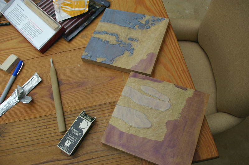


The finished blue plate is pictured, along with another plate meant to be part of the sky. Both plates are inked and ready to proof.


This proof shows the three plates combined together. I will still need to finish and proof one more plate, get some better paper, and work on my technique. Right now the prints are too splotchy. Once these issues have been worked out, I can think about doing a run of final prints.

Friday, July 22, 2011

Drypoint

Over the past year I have had a growing interest in printmaking. There are a lot of different methods of printmaking, so I wasn't sure what would be best suited to my style.

The most common form of printmaking practiced by artists has been some form of intaglio, such as etching or engraving. These techniques are for the most part an extension of drawing that play into the strengths of well-trained artists.

Drypoint, is such a technique. In contrast to etching or engraving, that partly rely on chemicals to create an image, drypoint is direct. The artist scratches out the image directly onto a plate with a sharp point. The burr created on either side of this impression holds the ink in place to print. Compared to an etching, a drypoint has a warmer and richer appearance. Its major drawback, is that it wears out relatively quickly. The delicate burr is worn down with every print that is made. Realistically, only about 20 impressions can be made before a drypoint is worn out.

Intaglio prints require an expensive etching press. Since I don't have access to one, I considered making drypoints a dead end.

To my surprise, I discovered that there is a way to print drypoints without an etching press. Websites such as this one cover the process in detail. This technique will only work with drypoints, other intalgio techniques still require the fancier equipment.

A metal plate is usually the basis of a drypoint print. Plastic, such as acrylic or plexiglass, can also be used. This has the advantage of being inexpensive and easy to cut. One can also see through clear plastic to a drawing on the other side.


I began by drawing out a loose outline of the image onto the plastic with a pen. The image will be a long-valley landscape scene.


After this was established, I began inscribing the lines into the acrylic with my drypoint needle. The black paper backdrop allows me to better see the work.


Once all of the lines are inscribed, the plate can be inked. The object to the top left is a dabber, for applying ink. I applied a large amount of ink, until the plate is completely covered.


The excess ink is wiped off of the plate using gauze, and torn phonebook pages. By wiping the image more or less, the final appearance can be tweaked. I took care to select what areas I wanted to highlight in the image.


The paper is dampened before it is printed. It was soaked in a tub of water for fifteen minutes.


The paper is then removed from the tub and placed in a towel to soak up excess water.


I used this old book press to make my print.


The plate is placed ink side up on a piece of mdf. The paper is then positioned on top.


A few sheets of felt are added over top the paper, and act as a cushion in the press. The print is finally ready to go in.


I was a bit disappointed to see how weak the final image came out. I haven't given up on this technique completely. With some experimentation, I hope to get some better results.

Friday, July 15, 2011

Summer


A recent work in progress, this was my first big project on gessoed oak panel. I braved the sauna-like July weather, and ventured out to a brand new location. For this painting, I'm still relying on my full palette of hand-made pigments.

This picture started off with a lot of promise. Then I started having a series of "off" days, and the picture suffered as a result. Especially in the foreground. I'm going to set this one aside for awhile and return to it.

Friday, July 8, 2011

More Studio Upgrades


I've made some additional changes to my studio, to make it better and more flexible. Making a new easel was just the first step. Ever since I moved into the studio, I've wanted to return to doing portraits and working from live models.

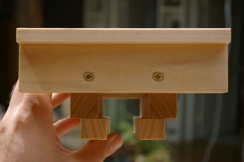
To be able to handle portraits, I needed a way to sit a model at eye level. The plywood platform that I built can be seen in the photo. This raises a seated model just up to the right level so that I'm not looking down on them as I stand and work. The platform has a box-frame on the inside to support the weight of the model sitting on it. At some point, I will paint the platform so that it doesn't stick out so badly.

To the rear you can see a curtain rod I put in to sit behind the model. This hangs from a rafter on the roof, and it can be moved around and adjusted. The curtain can also be taken off and changed so that I can adjust the color of the background.

I've tried out the current setup a few times and are really happy with it.

Monday, June 27, 2011

A New Easel

I've been kept busy lately, upgrading my studio so that I could start doing portraits. One area in particular that I felt was lacking, was a nice studio easel that wasn't too unwieldy.

At first I browsed through the offerings in art supply catalogs, but ultimately decided to make one for myself. I had some scrap poplar sitting around that was intended for making artist panels, that didn't make the grade. While it isn't the best material for this purpose, it was lightweight, already in my possession, and the price was right.

This was not a small undertaking. A very basic easel can be thrown together in a weekend, something with more functionality can take much longer to build. I wanted my easel to be as adjustable as commercial models, and that would require fabricating lots of moving parts. For this kind of job I would recommend at least some woodworking experience and decent basic tools.

There are a lot of plans online available for easels. Ben Grosser's website was a good starting point. I used a lot of his ideas and made some changes of my own.

The type of easel I built is known as an H-frame easel because of its shape. The main frame was the first piece I put together.


The basic H-frame under construction


Complete.

The finished frame is loosely mated to a base, and supported from the rear. Two-piece rear support "buttresses" are hinged and adjustable, so that the frame's angle can be changed from vertical.


Each top support has a hole for a bolt, that can be loosened and slide along a channel routed into the bottom support.

Finally, the easel must have a top and bottom clamp to hold the artwork. The bottom clamp locks down against the frame with bolts, onto a piece on the other side. This slides a long a channel cut in the middle.


The bottom clamp, with a locknut.

The top clamp is the final addition to the easel. It also has a channel built in so that it can slide along the middle.


The top clamp viewed from the underside, showing the channel that allows it to slide along the middle.


This clamp also has a threaded fitting, so that it can be locked in place once adjusted.


The finished easel, in the studio, ready to make art.


Friday, May 20, 2011

Tonalism, Revisited

I was pleasantly surprised to find a brand new book on Tonalism at my local library the other day. I am a bit of a fan of this style of artwork. While I was looking over this book, I was struck by something I had thought about before, why is it that some artists are households names, while others fade into obscurity?

In the case of the great masters, their fame is obvious: the genius of their work is easily observed by most people. There are some cases where an old master is lost or falls out of fashion. If an artist’s work has merit, they tend to be rediscovered at some point, even if it takes hundreds of years. These are not the kinds of artists I am thinking of.

The obscure artist tends to be unknown even to many art lovers, relegated to a mere footnote in some book. Their paintings are probably in the catalogs of small regional museums, lacking the clout to draw in the “big names” of art. Fans who visit these museums may discover that they are in storage and not on display. Obscure or unfashionable work is commonly sold off, often for firesale prices.

Obscure artists weren’t usually pioneers or innovators, merely participants in larger art movements. For this reason they tend to be ignored or dismissed as unoriginal. Even a relatively small art movement, such as Tonalism, had many of these followers. Their work can be inconsistent. I have chosen a few artists that caught my eye from the book:


Charles Warren Eaton, The Pine Grove


Charles Warren Eaton, River Landscape


Charles Warren Eaton, Winter Solitude


Lowell Birge Harrison, Moonrise on the Beach


Homer Dodge Martin, Wild Coast Newport


James Henry Moser, Fireworks Across the Potomac


John La Farge, Sea and Rocks Near Spouting Horn


Alexander Wyant, Pool on the Ausable

Tuesday, May 3, 2011

Sketch Class

I was recently told about a sketch class that was being held locally, once a week. Open to the public, one only had to pay a small fee to sttend.

For those of you not familiar, a "sketch class" is a chance for artists or anyone to get together and sketch a model in an impromptu set of poses. The poses vary in length, and are usually short, not being longer than a few hours. It is an excellent opportunity to hone one's skills, experiment with technique, and try to stay loose.

The first time I went, I was pleasantly surprised to find the overall level of the class to be very similar to what was offered in Florence. I havent done much figurative work for awhile, but familiar feelings arose almost immediately. The same general mistakes I used to make back in my art school years, resurfaced. I only had a few hours to work, so I had to try to correct these problems quickly and get a complete statement down on paper that was effective. It was an excellent challenge.

These sketches were mostly done in charcoal.


I even tried doing an oil sketch, painting directly on paper, coated with real gesso.